3D Warehouse link:
http://sketchup.google.com/3dwarehouse/details?mid=c333dab96a69c050f5f73c9ce6348bb7&prevstart=0
CryEngine3 Monument Level:
http://www.mediafire.com/?b6hnci8u27r1uy3
Sunday, 6 May 2012

EXP2 Final Model
From the initial monument and with my electroliquid aggregation quote in mind, I developed the model into a piece of architecture that can develop spaces as the natural environment encompassing it develops.
 |
| View from down the river |
A 'horizontal lift' powered partly by the river current transports students to the site from an alcove further up the river with road access (seen in the third image). The tracks semi-float on the river, and may possibly also mould. The 'lift' platform extends out to the ground.
 |
| 'Living' Space |
Parts of the architecture itself, such as these ivy circles and the trees within the wooden path shape, will grow and alter the shape. This sprouts from my electroliquid aggregation concept of living architecture with growing spaces of both nature and the architecture.
 |
| Site overview |
 |
| Sheltered space |
 |
| Play of shadows from the trees and lines of my 'light' material above |
 |
| Overview 2 |
The final image is a view of the 'Space Between', the lower rectangle with circular insets. This space is a combination of natural and artificial elements, and is clad with my medium texture which I elaborated on in my previous post.
Saturday, 5 May 2012
EXP2 Wk3 36 Custom Textures
Creating our own transition of textures from light to dark proved to be a little more difficult that I initially anticipated. I found that I had an idea of either the light or dark ends, but with 4 transitions between the two I had to really thing about how it would develop, and through a 'zooming in' effect, multiplying effect or some other one relevant to the pattern.
The light texture reminded me of rays of light, and the effect that it can have on the look and feel of a building at different angles. Seeing as I want my monument to mould and reflect it's surroundings, the lines could create an interesting effect with shadows and rays of light.
The medium texture I intend to use on the horizontal joining platform which will be a symbol of the platform and junction between architecture and nature. The texture itself shows a union of different lines that can be seen to form various shapes- so too can nature and architecture unite in different shapes.
The dark texture I have used on the central column. As it symbolises the strength of a tree trunk, I chose this texture due to its circular pattern mimicking the age rings of a tree.
 |
| Textures 1 & 2 |
 |
| Textures 3 & 4 |
 |
| Textures 5 & 6 |
As I worked on my textures, I tried to avoid in my later textures my tendency to stick to geometric shapes only. My most experimental was Texture 3, where I explored a familiar shape being distorted/viewed differently when repeated.
To place into my model I chose the following three Light, Medium and Dark textures, respectively:
 |
| Light, Medium and Dark textures used in my monument |
The light texture reminded me of rays of light, and the effect that it can have on the look and feel of a building at different angles. Seeing as I want my monument to mould and reflect it's surroundings, the lines could create an interesting effect with shadows and rays of light.
The medium texture I intend to use on the horizontal joining platform which will be a symbol of the platform and junction between architecture and nature. The texture itself shows a union of different lines that can be seen to form various shapes- so too can nature and architecture unite in different shapes.
The dark texture I have used on the central column. As it symbolises the strength of a tree trunk, I chose this texture due to its circular pattern mimicking the age rings of a tree.
 |
| Monument with applied custom textures |
Thursday, 3 May 2012
EXP2 Wk2 CE3 & Electroliquid Aggregation
 |
| F. Otto 'Space Efficient' & E. Diller 'Manipulation of Natural Elements' |
 |
| First phase in Sketchup |
When considered, nature itself is very space efficient- using its surroundings to the most potential in seemingly sparse environments. For an example of this, see my 'Pre-Class Task' for ARCH1101 in which I provide a photograph of such a circumstance. At the same time, the environment plays a very large role in shaping architecture. One could say they are intertwined, and thus space efficiency has close ties to moulding with natural elements.
Once placed into an environment, and following more development into details this monument should reflect and interact with its surroundings fluidly.


The three vertical green elements are ivy covered, with metalic cross-beams. The rest of the structure is concrete, possibly of a low grade finish for a less artificial look. The inside of the blue room is lighter, as I'd imagine this is where some people could meet to discuss ideas and the light colour is inspired by the typical 'lightbulb idea'.
Electroliquid Aggregation: Living Architecture
Space Efficient: Frei Otto's architecture worked a lot on efficiency of space and materials through minimal path systems. This does not mean putting the most into a space- it is more getting the most out of a space. As a result, his works are all very calculated, yet still very dynamic and appealing.
Manipulation of Natural Elements: Manipulation is to skilfully edit or control something, which can be seen in The High Line Park where she effectively lifts the natural environment above a pedestrian area. Her architecture, though no always, does take into consideration and integration trees and greenery, through openness and perhaps even appreciation of what already exists.
Both Space Efficiency and Manipulation of Natural Elements can be seen as our attempts at working within an environment. Usually considered oppositions, space efficiency suggests that one must compromise to work within but not as a part of its surroundings, and Diller's concept takes a step further by using its environment. In this sense, the electroliquid aggregation is the junction of human-made and natural- of something that is controlled, linear or ordered and something of randomness, flow and 'disorder'. Both inhabit a space and use it, and as such they shouldn't clash.
My electroliquid aggregation with this model is of Living Architecture. It grows around, within, and with its surroundings. Architecture creates shifting spaces as nature does, through extensions and demolitions, and with technology as well. Seasons can greatly impact what occurs with architecture too- for example if there is a vine covered wall, or a deciduous tree nearby. Architecture breathes and ages with time just as nature does, and accommodates for changes in the space around it, thus efficiently using the space while being moulded and united with nature.
Wednesday, 2 May 2012
EXP2 Wk2 Parallel Projections
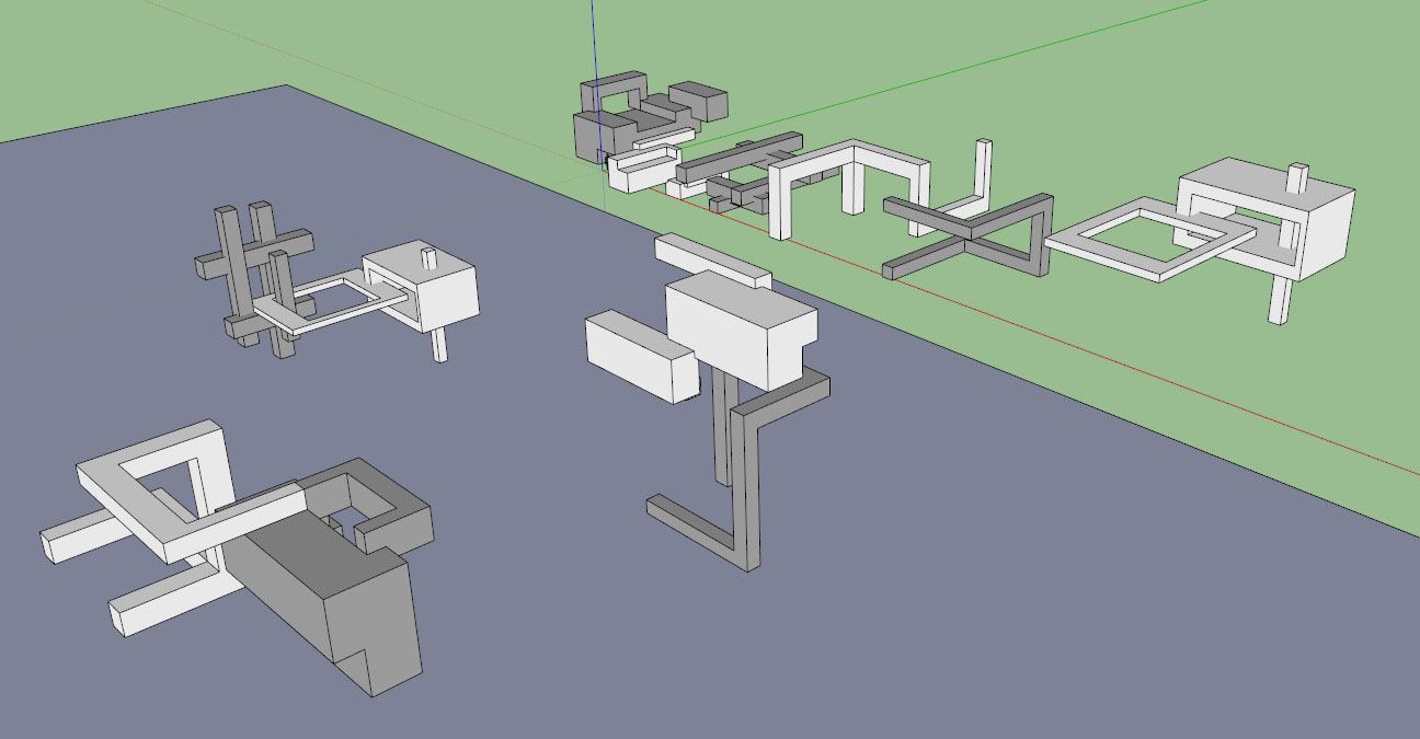 |
| The 6 original models and the 3 final combinations. Grey: Frei Otto, White: Elizabeth Diller |
Frei Otto: Space Efficiency & Elizabeth Diller: Manipulation of Natural Elements
With this combination, I believe the two models compliment each other very well. The only parts touching the ground are the column on the right (in the top view) and the longest vertical beam ofthe cross-hatching model encompassing the horizontal plane. This two-point support column is inspired by real tree trunks, that support a large weight and wide canopy. This links with Diller's concept, and the Otto model compliments it by creating a structure reminiscent of vines or tangled branches.
At the same time, Diller's model also works with Otto's model for space efficiency, as it is raised and both creates and shelters a space beneath it.
The union of the two manages a large ground space with a 'canopy' above. while still allowing for intimate spaces such as inside the 'tree', and in the surrounded path corner.
Frei Otto: Undulating Forms & Elizabeth Diller: Public Exterior
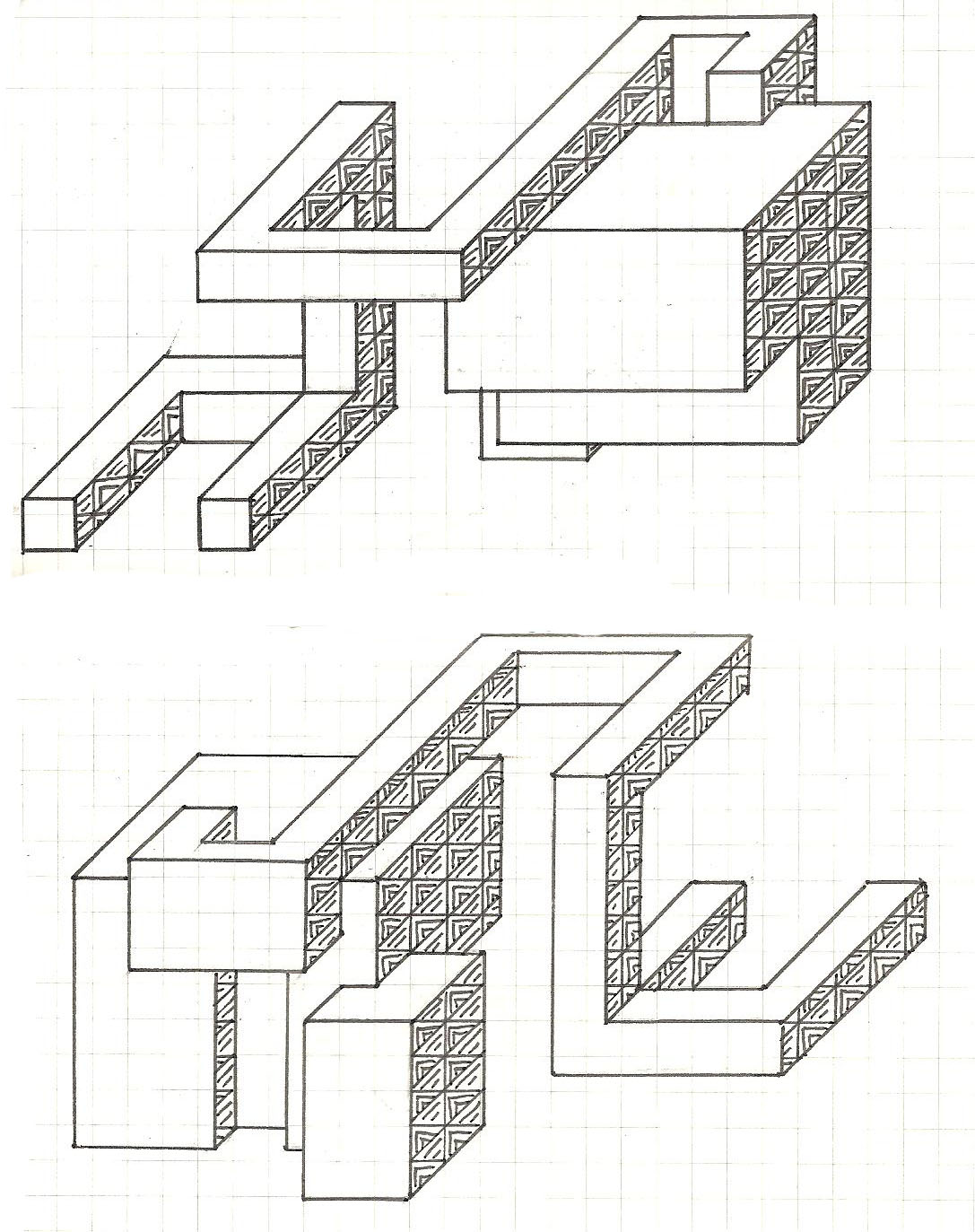
These two forms I made to be an extension of each other. I believe the Diller model still carries through a sense of undulation through its flow of shapes. The monument sits on the two horizontal 'legs' as well as the small block seen in the bottom view. Both shapes accommodate ground space (as with the previous monument) but there are more 'nooks' with this one. This plays on the "Public Exterior" idea, where the entire shape in itself is quite open, but in still maintains private spaces.
In my vision for this combination, the biggest block could suit an auditorium/theatre like set-up. The entire area is quite open, therefore most of the spaces would be outside. If I'm to further develop this monument, I will need to consider shelter options, as well as how to organise an open space around this central piece.
Frei Otto: Weightlessness & Elizabeth Diller: Free Flowing

[Please note the right drawing is taken from the angle indicated instead of from the opposing angle to allow for the viewing of the small rectangular prism. There is also one shape missing which can be seen in the sketchup model image above]
As with the first monument, the two concepts from my clients intertwine in this monument. The 'heavy' blocks from Diller's model are being supported by Otto's 'weightless' structure. giving the appearance of strength through minimal support- a trait very strong in most of Otto's work. The two aligning horizontal pieces from Otto's model (their tops are shaded in the right image) continue and extend the flowing shape of Diller's model. Overall both concepts are strengthened.
In terms of spaces created in their union, I have consciously created the covered space between the two models (the long 'corridor' with one side open). From this, a ground space was created beneath the monument, providing an area for architecture students from various schools to meet.
Tuesday, 1 May 2012
EXP2 Wk1 Cryengine model
I chose to develop my fifth axonometric in sketchup and then placing it into my CryEngine3 environment.
I chose this model as I felt it could interact the most effectively with the environment I had set up. It has what could be a major living space, as well as a smaller space (the red rectangular prism) that both have windows to take in the view from an elevated site.
As well as that, the undulating form of my model reflects the mountainous terrain on which it sits.
The light orange material is bamboo/wooden to both blend in, in terms of natural materials, and to provide a 'sleekness' beside the rough trees to create a smoother and more pleasant living space. The red contracts work to bring highlights to the building as well as to represent the grandiose and important feel a house with a view would emanate.
 |
| Elizabeth Diller: Aerodynamic/Undulating Forms |
I chose this model as I felt it could interact the most effectively with the environment I had set up. It has what could be a major living space, as well as a smaller space (the red rectangular prism) that both have windows to take in the view from an elevated site.
As well as that, the undulating form of my model reflects the mountainous terrain on which it sits.
 |
| View one of my model in CryEngine 3 |
 |
| View two |
EXP2 Wk1 Axonometric Drawings
The first class task for Experiment Two was to research our two clients Elizabeth Diller (from Diller Scofidio + Renfro Architects) and Frei Otto, then based on some concepts in their word draw 6 axonometric drawings constructed from 5 rectangles in positive or negative space.
I: Frei Otto - Space Efficient
II: Elizabeth Diller - Free-flowing/Clean Structure
III: Elizabeth Diller - Public Exterior
IV: Frei Otto - Weightless
V: Frei Otto - Aerodynamic, Undulating
VI: Elizabeth Diller - Manipulation of natural elements
I redrew the first axonometric at a different angle, to give a clearer depth and heigh understanding:
I: Frei Otto - Space Efficient
II: Elizabeth Diller - Free-flowing/Clean Structure
III: Elizabeth Diller - Public Exterior
IV: Frei Otto - Weightless
V: Frei Otto - Aerodynamic, Undulating
VI: Elizabeth Diller - Manipulation of natural elements
 |
| Collection of axonometric drawings representing concepts from Frei Otto and Elizabeth Diller |
I redrew the first axonometric at a different angle, to give a clearer depth and heigh understanding:
 |
| First axonometric presented from a different view |
Subscribe to:
Posts (Atom)