Sunday, 25 March 2012
Week 4 Animations
My three animations are aimed at providing a clearer understanding of the different spaces in both studios.
The final exhibition space is drawn together by both studio spaces- the hexagonal shapes and the extending arms of Weiwei's studio space. Below are some stills of the final model:
The final exhibition space is drawn together by both studio spaces- the hexagonal shapes and the extending arms of Weiwei's studio space. Below are some stills of the final model:
Week 3 Materials
In groups we brainstormed works describing materials, and then categorised them into Above, On and Below ground. Mine were as follows:
Above
Delicate
Transparent
Light
Wavy
Curvy
Intricate
Soft
Malleable
Lustrous
Undulating
Flexible
Refractive
Middle
Striated
Layered
Bold
Ductile
Fibrous
Angular
Patterned
Crumpled
Viscous
Dry
Below
Magnetic
Absorbent
Abrasive
Granular
Brittle
Course
Heavy
Abstract
Porous
Sticky
Solid
Flakey
Crystalline
Conductive
Extra
Cold
Opaque
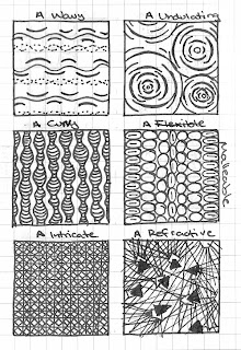
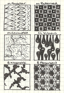
The 36 textures I developed are shown below, of which I included Transparent (above), Dry (middle) and Solid (below) into my model.

In addition, we were required to find a video that relates to our model in some manner. The video I have selected communicates how glass in being used increasingly in modern architecture and how it can effect its surroundings. I find this quite important, seeing as my large above-ground model uses glass or transparent materials throughout. Although odd to have so much of a building made of glass, the video demonstrates some buildings (such as the Apple store) as utilising the material very effectively.
Above
Delicate
Transparent
Light
Wavy
Curvy
Intricate
Soft
Malleable
Lustrous
Undulating
Flexible
Refractive
Middle
Striated
Layered
Bold
Ductile
Fibrous
Angular
Patterned
Crumpled
Viscous
Dry
Below
Magnetic
Absorbent
Abrasive
Granular
Brittle
Course
Heavy
Abstract
Porous
Sticky
Solid
Flakey
Crystalline
Conductive
Extra
Cold
Opaque
The 36 textures I developed are shown below, of which I included Transparent (above), Dry (middle) and Solid (below) into my model.


In addition, we were required to find a video that relates to our model in some manner. The video I have selected communicates how glass in being used increasingly in modern architecture and how it can effect its surroundings. I find this quite important, seeing as my large above-ground model uses glass or transparent materials throughout. Although odd to have so much of a building made of glass, the video demonstrates some buildings (such as the Apple store) as utilising the material very effectively.
Sunday, 18 March 2012
Week 2-3- Stairs
Having never considered the effect a well designed staircase can have on a space, I found the task of designing stairs for our models to be a really eye-opening and interesting one.
The third staircase also uses a customised path, with a thicker material and shape selection to suit an underground staircase leading to a heavier space (with the keyword 'Cell')
My first set of stairs I designed to give a sense of unity as one moves from above to below ground. The four branches reach down to a common goal and people on different spiral arms can still feel united as they will come together in the end. Spiral staircases interest me through the fluidity that they portray in their shape, as oppose to more conventional straight stairs.
The second set of stairs, for above ground use, gives more power to the user. The randomly positioned steps makes the user choose what path they wish to take- making the experience customised.
My final stairs play on transparency, so that they don't hinder the view of the space. From the right view, they are also meant to mimic a spiral or helix shape. Initially, there was a translucent wall in the middle so that the stairs appear to cantilever off it, but actually cantilever from steel beams below. However when the stairs were positioned in the model, I decided to remove the wall.
The third staircase also uses a customised path, with a thicker material and shape selection to suit an underground staircase leading to a heavier space (with the keyword 'Cell')
 |
| Original section for second model |
My second section that I developed is shown below, with the staircases in progress.
 |
| Above ground- Ai Weiwei - 'Push' |
 |
| Below Ground - Louise Bourgeois - 'Cell' |
The materials I have chosen more accurately reflect the rendering style used in my hand-drawn section. Above the datum, I wanted a delicate and/or transparent material. In the sketchup model, the top 'roof' part is my own material tile for "Transparency". There will be a closer image in my next post on materials. All the horizontal elements in the above-ground studio have tiles, as they softly reflect light and, in my opinion, give more light to a space. I chose such light materials to reflect what I believe suits Ai Weiwei. Being a human rights activist, the open and light-generous spaces should represent freedom, something I believe he would want seeing as he is imprisoned often for his openly critical opinions. The open spaces also importantly accommodate for Weiwei's large-scale artworks, such as will be seen in the final model.
Below ground is my allocated studio for Louise Bourgeois. This space is broken into smaller spaces by custom columns which also serve to support the roof. The materials will be of heavy concrete or stone, to reflect the dark nature of this artists work. There is a variety of large and small spaces to accommodate Louise's different artworks. The hexagon stairs (half-developed in the image) are clad with a custom texture of the word "Solid".
Tuesday, 6 March 2012
Week 1 Sketchup Model
After exploring combinations of keywords and section styles, I decided to choose the below sketch as the basis for my 3D model. The section above the datum spread from the keyword 'Internalised' and should be a series of spaces that are semi-separate from each other in that they aren't all clearly seen at any one time. Below the datum, the idea is that the positioning of the walls and paths would 'push' you in certain directions ('Push' being the keyword). The two sides communicate with each other through the mutual beginning at the datum:
From this sketch, I reached the following results in my attempts at fleshing out the section into three dimensions:
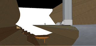
The above two images show the spaces in semi-perspective, showing the scale of the buildings. The image to the right demonstrates how the two spaces are connected (the yellow section is the ground, transparent for convenience).
The materials used above ground are mainly metals of various grades (smooth for workshop areas, rougher for supporting poles). There is also a 'wave' which on one side is wood clad and on the other shelters a wall of ivy (below which is a pool of water). The fast floor space serves the public, whereas the raised spaces are the workshop spaces.
The underground space also continues the use of metal, but only for a sense of continuity. The main materials used here are various wood types, tiles/stonework for the main flat, while the ground itself is a soil/sand composition.
 |
| The original section sketch |

The above two images show the spaces in semi-perspective, showing the scale of the buildings. The image to the right demonstrates how the two spaces are connected (the yellow section is the ground, transparent for convenience).
The materials used above ground are mainly metals of various grades (smooth for workshop areas, rougher for supporting poles). There is also a 'wave' which on one side is wood clad and on the other shelters a wall of ivy (below which is a pool of water). The fast floor space serves the public, whereas the raised spaces are the workshop spaces.
The underground space also continues the use of metal, but only for a sense of continuity. The main materials used here are various wood types, tiles/stonework for the main flat, while the ground itself is a soil/sand composition.
Subscribe to:
Comments (Atom)


