Saturday, 30 June 2012

EXP3: Final images

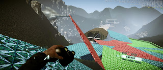
T2 Manager's table (and chairs)

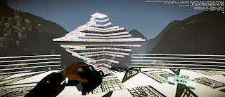
Model from south side

Entrance to the T2 side of the bridge

Custom stairs

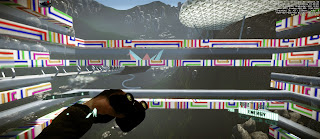
Stairs and feature walls for Facebook

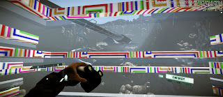
View of bridge from East Side from inside the Facebook lift

EXP3: The Table

 The design of my table is for 'ideas coming together' just as the table parts come together as in a puzzle. There are two 'leaves' at which people can sit facing each other, however they overlap partly in an area which is a union of the two companies.
At the same time, there are two longer 'leaves' for more private consultation, and the four sections also allow for a separation of groups within the two companies. 


Table upon approach.

Transition

Completed Table

EXP3: Final links

CryEngine File: http://www.mediafire.com/?25y1xiyk6r3fymj

Sketchup Warehouse File: http://sketchup.google.com/3dwarehouse/details?mid=66da270ab5923c2aac73565d676c074a

Friday, 29 June 2012

EXP3: FB Lift

Again, with Facebook I decided to have a minor and major lift. I created a many tiered building to create privacy and distinction within the various groups within Facebook, however each level is a simple plane in order to retain the a sense of being public, united and connected to other parts of the company (for my power concept is that to have power you must listen to the public, before being able to dictate it).

FB minor lift leading to the second level

The shape of the lift is a swirl, to represent that even though you are on your own path, you are part of a greater shape. This lift is but a simple verticle moving entity, and did not take me long to create a flow chart for except for aligning the height correctly.

FB major lift before engaging.
(Note: the level in the back is designed to be a main office, similar to the T2 Plateau)

FB major lift after activation and before moving

The main lift for Facebook is more public, and I made it round and red to stand out from its surroundings, for variety. The dome's physical properties are altered so that when you stand on the red circle, the dome will rise up around/through you, however the surface is solid when pushed to get in/out. This lift takes a path past the other spaces in the building to continue that everything is connected (as opposed to the T2 lift which takes you straight to your destination).

View 1 from lift

View 2 from lift

Thursday, 28 June 2012

EXP3: T2 Lift


My building for T2 was based around bright 'game like' materials and shapes, inspired by tron and sci-fi, but also revolving around the idea of openness.
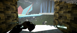
Minor T2 lift making its way to the plateau

View of the T2 quarters, with the lift almost at the plateau
I created a small lift that would go to a plateau sitting on the hill near a geyser. (As a sidenote, the geysers remind me of the horror game Bioshock, by T2). The client would run to the end of the undercover path, step on the round base, and glass/perspex 'spikes' would rise from beneath the edges to form a barricade (for safety). These will then retract once the lift has landed on the plateau.
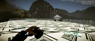
View from minor lift to main T2 lift 
7 of the 17 arms rotate to close the lift around you

View 1 from lift

View 2 from lift
The main lift was inspired by levels, and the old-school puzzle games. The diamond shape represents something valuable, as I imagine this lift to be a personal transport for an important person within T2 travelling down to the board table.

I had many issues getting this lift right, from having to construct a flow chart containing 5 components (one for each two sets of 'arms'), to having them rotate about a central axis, and calculating the exact direction vector for the lift to move.
My character was also being flung off by a glich in the movement of the lift, however I solved this by (painfully) adding glass retaining between each arm.

Overall, I am very pleased with my lift design, and how I have gotten it to move. I only wish I had a video to further show its details.

Sunday, 27 May 2012

EXP3: 36 Custom Textures


I tried to explore both literal and conceptual ideas of movement. Conceptually, I explored elements such as the speed of the movement, the occurance of the movement in real life (eg, the 'tumbledryer' and the erratic butterfly pattern) and extended the simple drawings to more complex ones.
I did find it hard to be very diverse in my three personal words, and to have a variety within each word (eg, not having the same type of scalar transition just in different shapes.)

Thursday, 24 May 2012

EXP3: 18 Two Point Perspectives

As expected, the two point perspectives were slightly difficult at first to understand, and then the changing angles from the top and bottom views also took some time to draw correctly.

With the two point perspectives I noticed my drawings and combinations were more focused on thinner spaces, that combined together into walls and more enclosed spaces.

First Set

Second Set

Third Set

Fourth Set

Fifth Set

Final Set

The power words this time were harder to choose, perhaps because the combinations were more complex or that they were more relate-able to spaces.
However, these combinations are much more interesting in my opinion, to the single point perspectives.